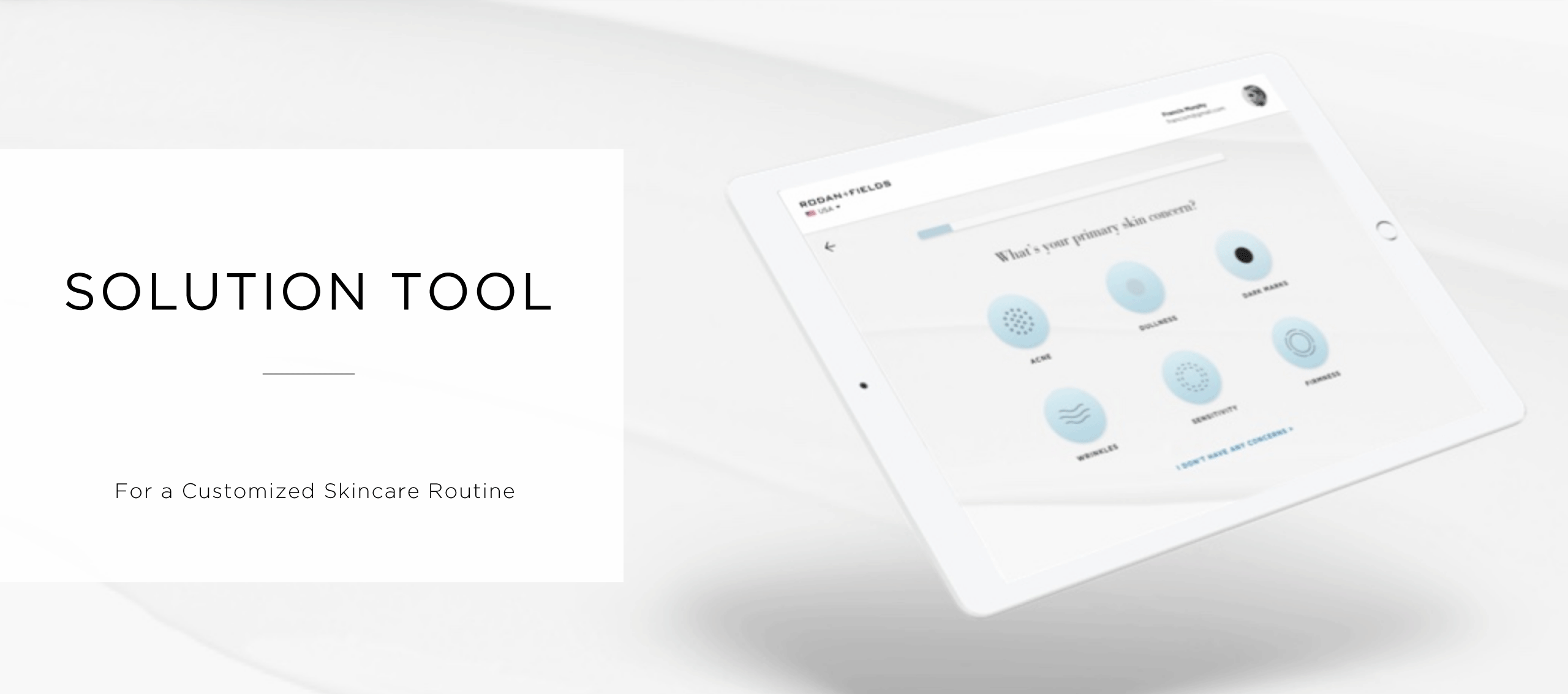
R+F Solution Tool
End-to-End Service Design of a Skincare Engagement Journey
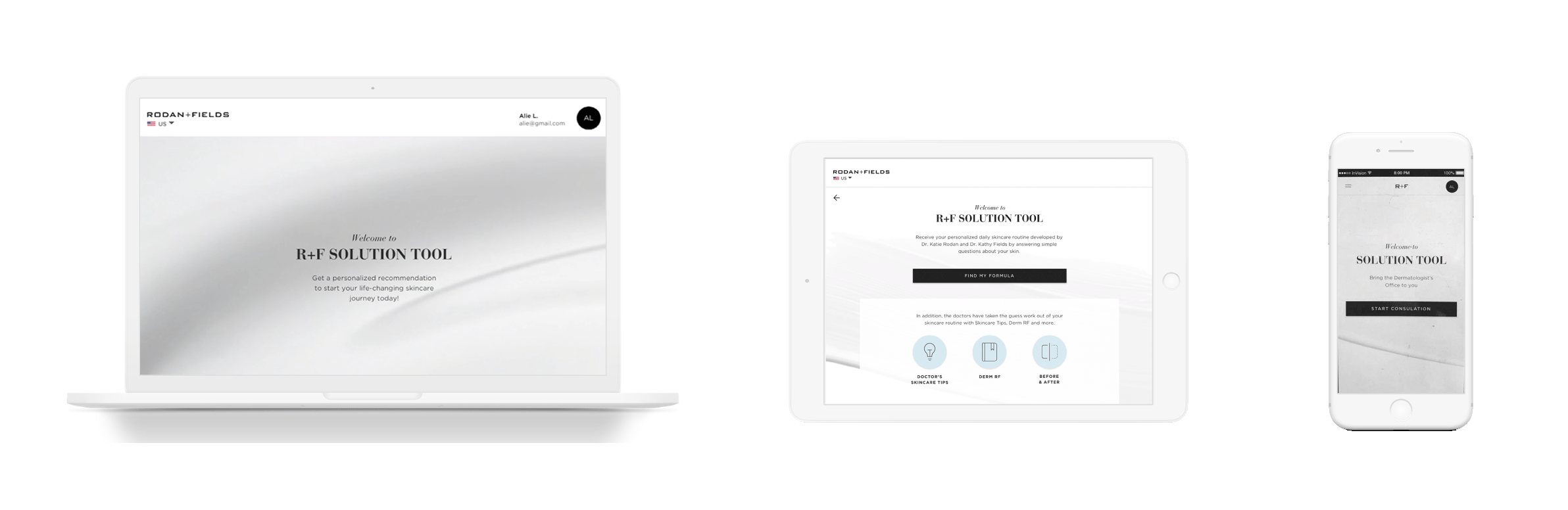
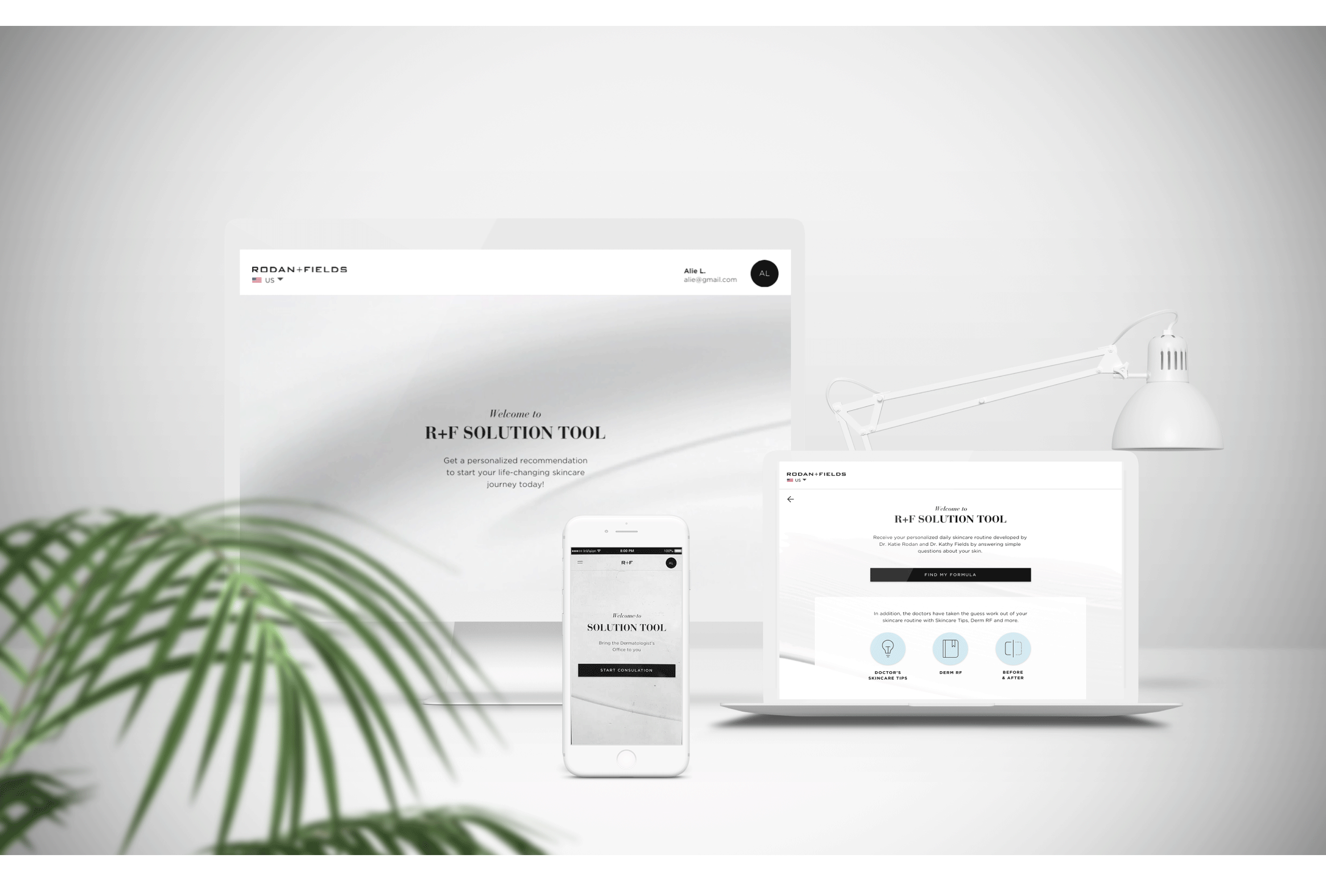
Skin Solution Tool is a redesigned project and a feature that lives on the Rodan + Fields website. It helps our Preferred Customers to find out what the best Rodan + Fields skin products for them are. It works cross-platform on laptop, tablet and phone.
The Challenge
How might we redesign a personalized, digital skincare experience that adds value for our preferred customers and maintains their engagement from their initial interaction with R+F?

My Role
As a UX design intern, I was tasked with leading the complete redesign of the project, collaborating closely with the Design Manager, fellow Product Designers, and a UX Researcher.

Our Goal
Design a skincare journey to attract new preferred customers and reduce drop-off when reordering a product.

Deliverables
High-Fidelity Mockups for responsive web, animated prototypes (Principle and InVision), Journey Map and Service Blueprint, Task Flows
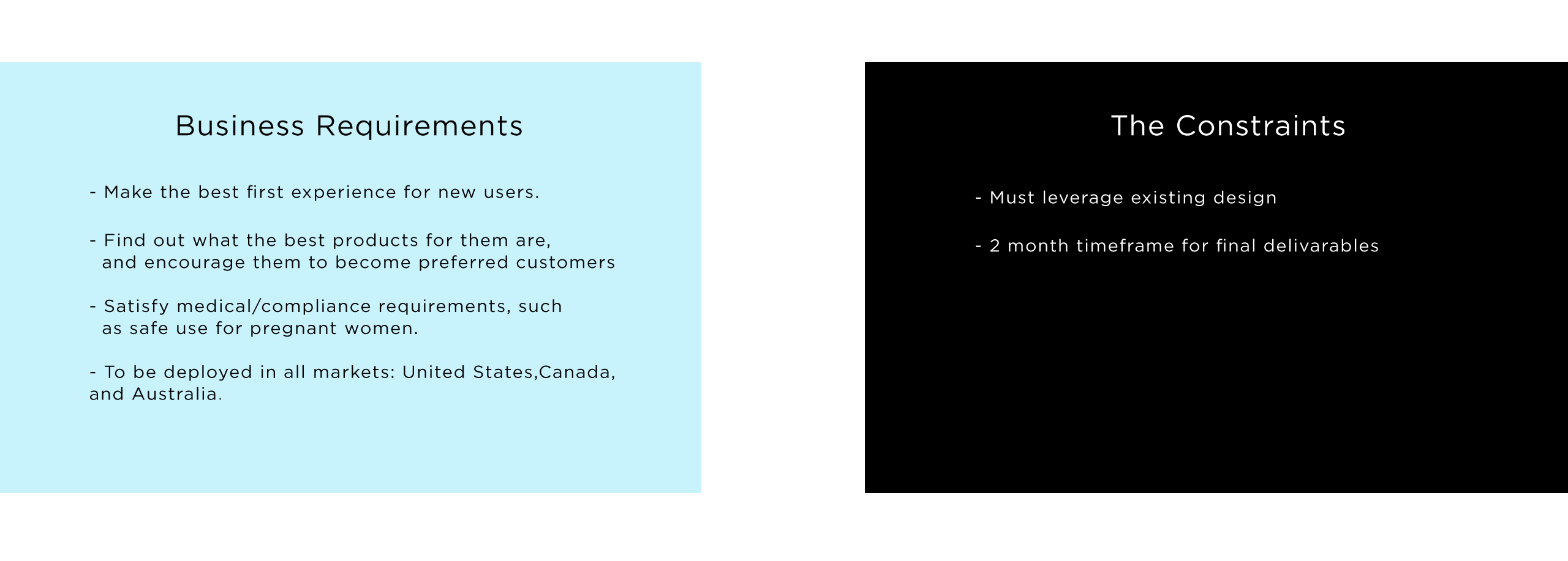
The Requirements & Constraints
Digging Deeper
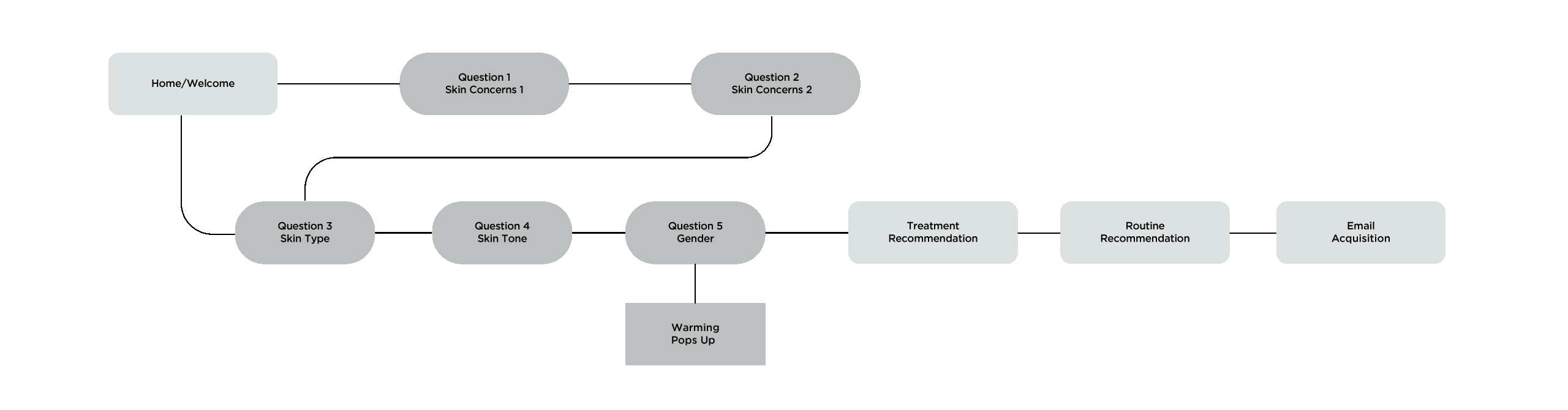
Understand the old/existing design: We printed out and pined the existing solution tool user interface to the wall, to try to understand it.
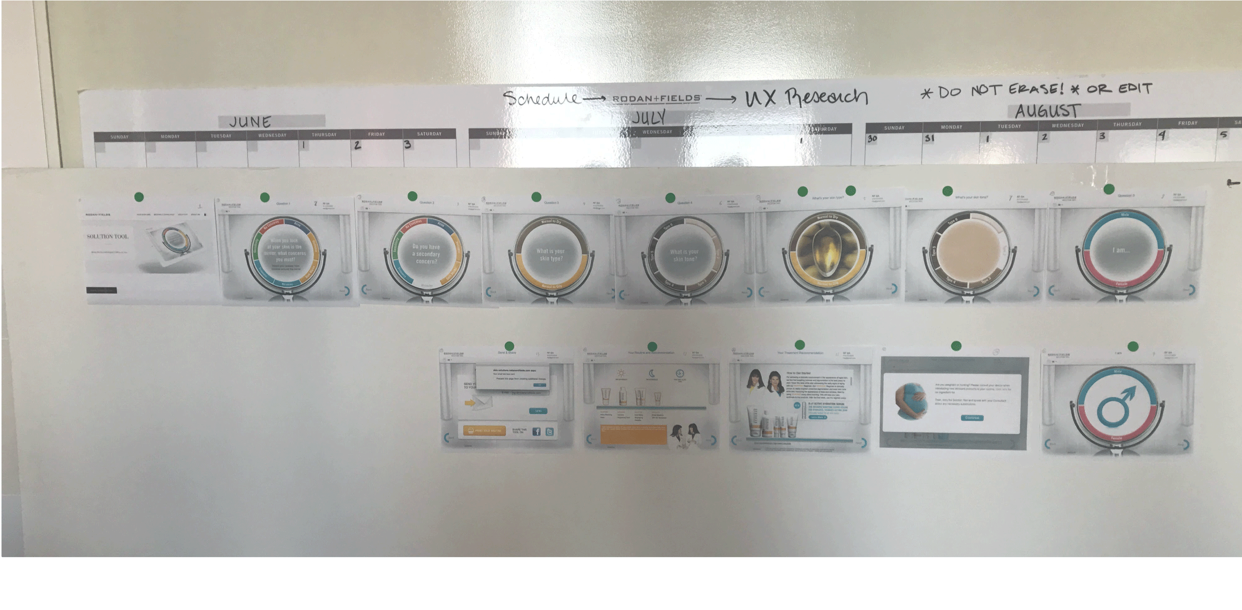
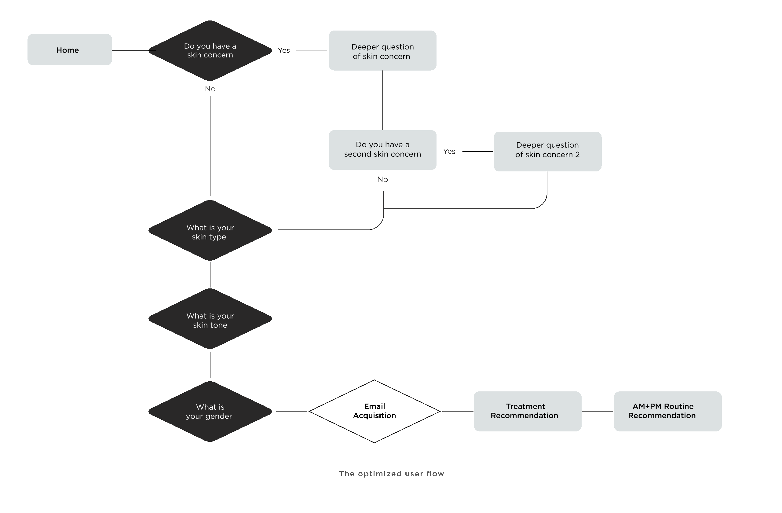
We then re-diagrammed it, removing the styling so we could better understand the flow.
Testing the Existing Work Flow
To find out what the problem is, we had to test the current flow to understand the pain points.
Our team quickly put together a testing plan, recruited users based on our existing personas, and moderated 6 user tests across desktop and mobile, with the help of Usertesting.com.
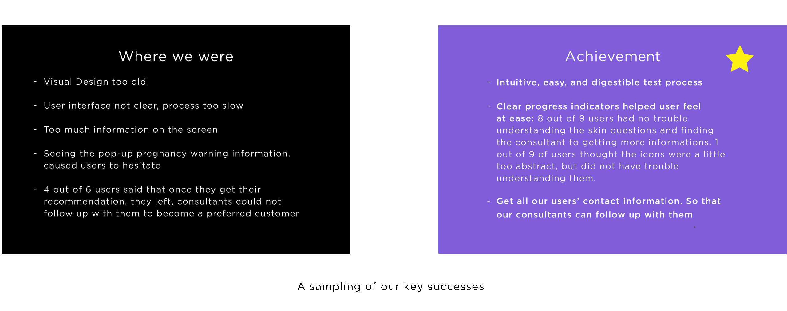
When the results came in, they confirmed many of the pain points we knew about, but also brought to light ones we didn’t:
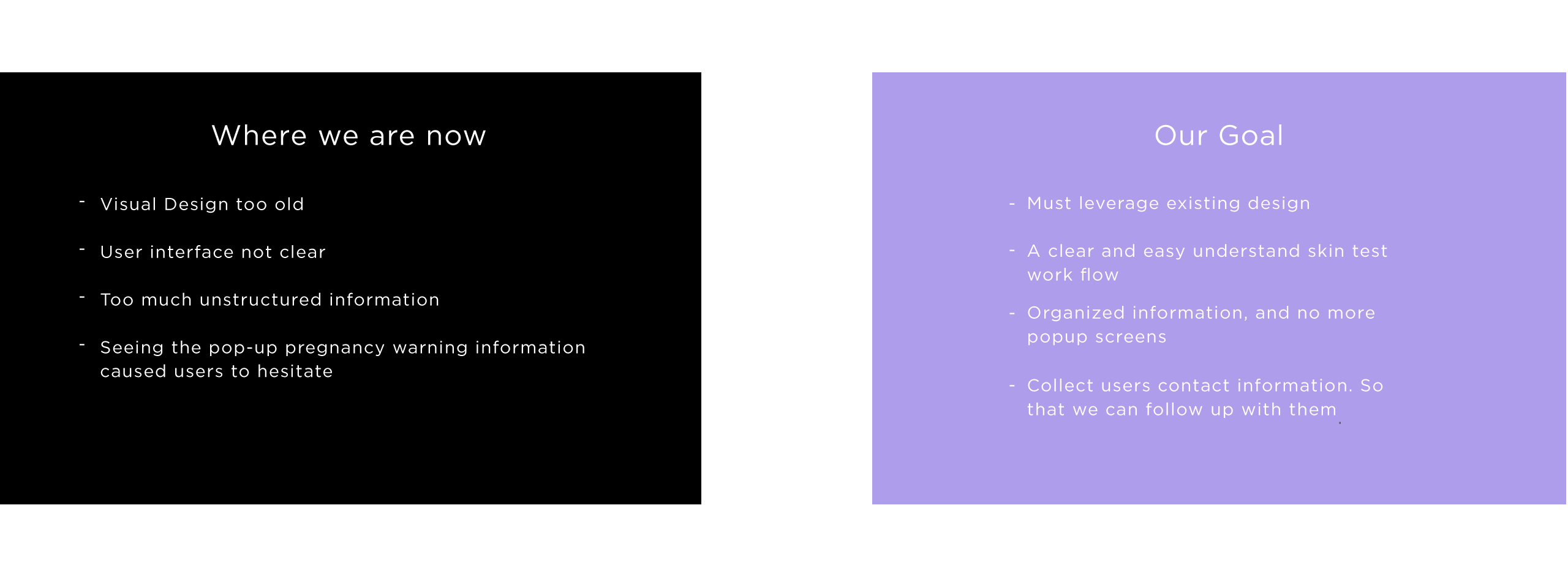
Business VS User’s Goal
It was immediately clear out of testing that there was friction between our business and user needs. This tool is to help our consultants to better explain what skin care product in R+F’s lineup are the best fit for their customers. This also leads to them potentially becoming Preferred Customers in the future, generating more sales. Our new users want to find out the base minimum proucts they need to get the best outcome. Initially they thought the information was unstructured, and difficult to understand. But we believe this is an easy problem to solve.
Ideation
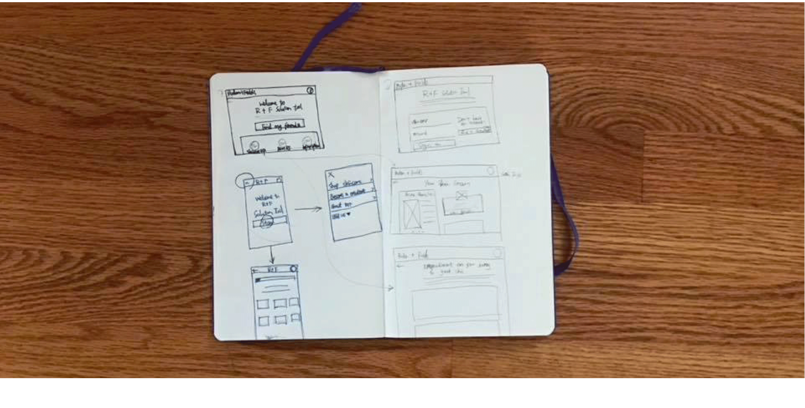
Sketch of Ideation.
Wireframe
I began sketching out how this flow would look across all devices. These sketches later turned into low-fidelity wireframes made in Sketch:
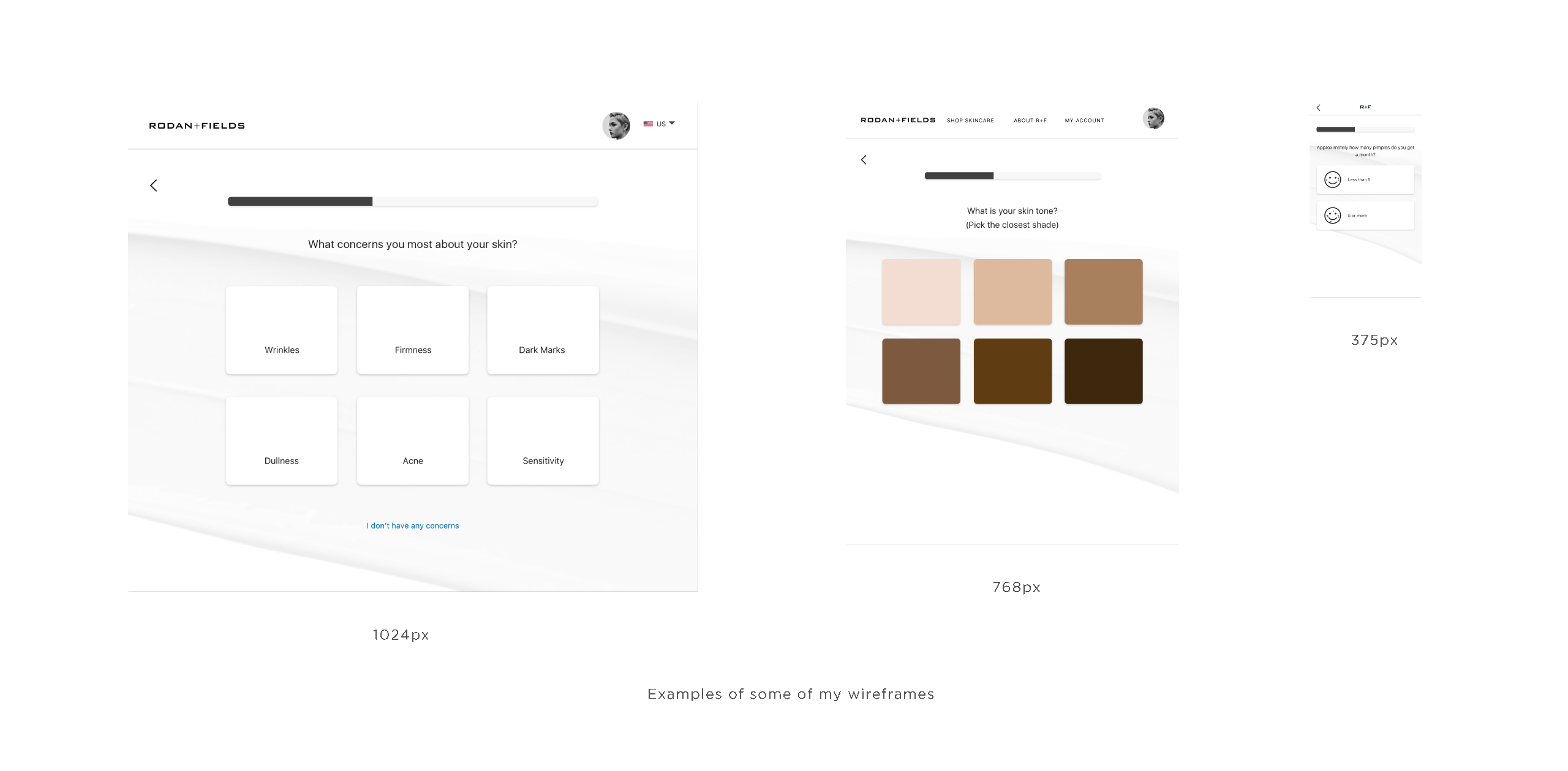
We did some key changes:
Provided clear, visual explanation of key skin test questions. Provided deeper questions about user’s skin concerns. Used abstract icons showcase the modern visual vibes. After talking to our Dermatologist, we got rid of the pregnancy information popup screen. Collected users’s email addresses before we provide them the treatment recommendation and routine recommendation.
Second Round Tested
Armed with my first round of wireframes, I put together a quick and dirty prototype with InVision, and launched 6 more user tests on the prototype to see whether it resonated with potential users.
The test was successful, validating many of the design decisions we made. Users found the flow intuitive and easy-to-follow. Only 1 user complained about flow length, compared to 80% of testers on the original flow.
Testers understood what we want to provide to them, and managed to complete it with no friction.
Even better, we got all of our new user’s follow up contact information.
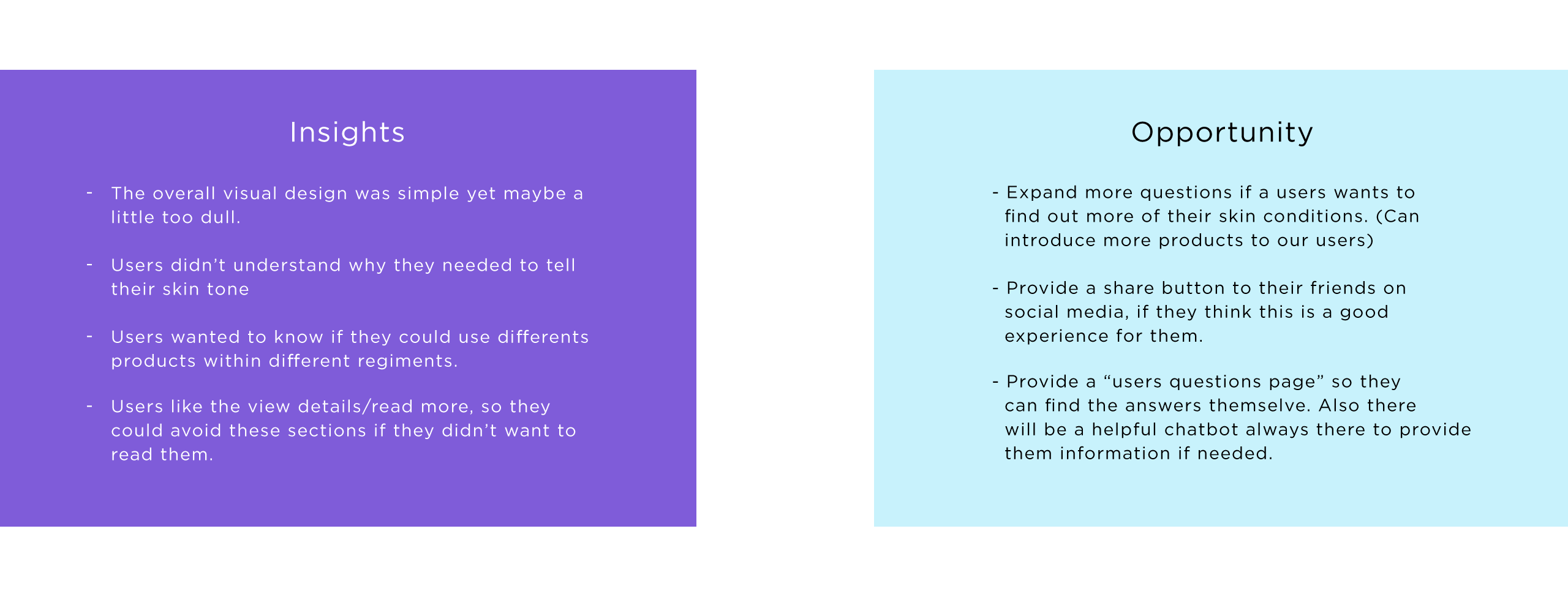
However, I still found many things I could improve on, which I addressed in our next iteration.
As I iterated, I also routed the design through stakeholder approvals. We worked with vendors and internal business partners to ensure that the product complied with business rules, legal requirements and internal goals.
Visual Design
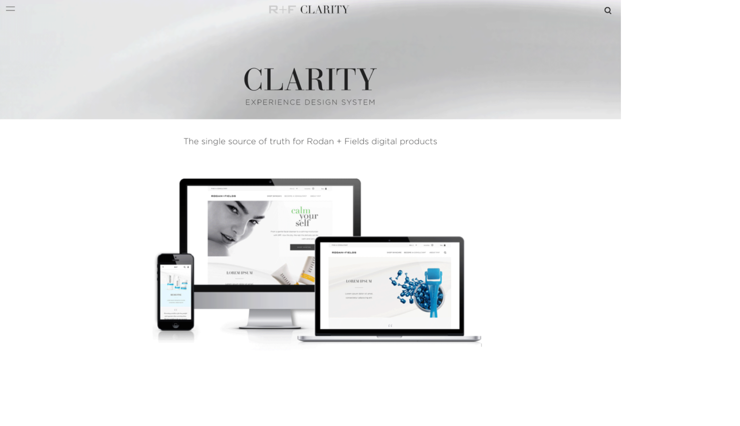
After receiving all the buy-in I needed, I made final tweaks and applied visual style to my wireframes. To ensure consistently I referenced our team’s Clarity Experience Design System. As I finalized component designs for the Solution tool flow, I also fed any changes back into our design system.
We designed for three breakpoints, according to the most-used screen sizes of our customers. A standard 12 column grid layout was leveraged across all designs. The result was a bright, clean yet classic visual style that communicated our brand essence and still provided visual delight.
Final Testing and Development
For our last round of testing, I plugged the high fidelity mockups into InVision and took the flow to our users for a final round of feedback.
Preferred Customers were delighted with the new process, noting specifically the shortening of the flow, the placement of the autoship shopping process and the clear explanations of business benefits and the R+F business model.
The new flow launched on August 31, 2017. I planned to continue monitoring the numbers, see how it performed, and iterate based on those findings.
You can view the mobile one here:
If you didn't see aboving prorotype just try this link:
